Saturday, August 20, 2011

Museo Centro de Arte Reina Sofia


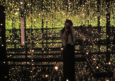
I just got back from Europe and I have so many pictures I would love to share. One of the first buildings we went to in Madrid was the Reina Sofia Museum, right across Atocha's train station. What I like about the building is that you can see when the restorations took place, you can easily separate the architecture styles. In 1980 Antonio Fernandez de Alba incorporated 3 amazing glass and steel lifts that give you access to every single floor of the building. Inside we got to see some of the best artists of the 20th Century: Picasso, Miro and Dali.

Tuesday, August 16, 2011

Coco's Room


For a Coco Chanel inspired bedroom I decided it had to be simple, classic and elegant. Never out of style. Neutral colors and some touches of luxury with key accent pieces. My favorite piece of the room is a MDF cabinet designed by kamina&C. I think it goes perfect with the Chanel style since the texture of the cabinet resembles those quilted bags we love so much! Another great piece I found after hard searching for it is a "Pearl Chandelier" designed in 2006 by Hanna Brogård. Then I wanted the full length mirrors like the ones she had on her Paris Atelier, the mirror I chose is called Snowhite Full Length and can be found at GoModern.com. Kartell lamps are on top of my list, whenever I get a chance to incorporate them in my designs I go for it. This time I've chosen the Kartell Bourgie Lamp in gold to work as one of my accent pieces. To keep the french spirit alive I decided to include a french vintage chair from Jayson Home & Garden. My room wouldn't be completed with some art work, a painting by Isaac Israeli "A woman before Van Gogh's Sunflowers" to keep my gold yellow colors flowing. Last but not least, a bouquet of fresh camelias, something I am pretty sure Coco would love to have in her room.


Sunday, June 5, 2011

I heart Zara


Here are some of the latest looks from Zara. This year I am obsessed with blue!

AUSTRALIAN RIGHTS FOR ZARA


I recently discovered that Zara opened a store in Sydney Australia, so I was very eager to look up some pictures of how the store looked like. Here's what I found.


I used to work at Zara, and I must say I love how they use the mannequins! It is such a great way to show customers some of the key items of the season. This items are guaranteed to sell!


Props to Mr. Amancio Ortega for taking it to the next level. Zara is a big name in retail and it is one of the most successful stores all over the world.


FOSTER THE PEOPLE

PUMPED UP KIDS


Kids? What can we say about kids? I'm really not sure, but one thing I know is that kids go everywhere. Now with divorce, single parents or gay parents the concept of quality time with them has completely changed. The twenty-first century marketer is focused on teen and kids. Reason why stores should by kid friendly, integrating a spacial design with automatic doors, wide aisles for strollers, and preferably no steps. Otherwise, most parents would try to avoid places where kids are not welcomed.

Kids love shopping too, they love feeling being helpful to mommy and daddy. Why not give them something to shop for too? The only thing you gotta keep in mind is to put the target articles low enough for them to see and reach them. Kids will try and grab anything, it is only important to have it childproof!

Here's a bookstore I found in Beijing, called Republic. Especially designed just for kids. A wonderful and clever paradise.


Everything seems so playful, colorful and within reach for kids to try and beg for mom or dad to buy it for them.


Who knew reading could be so much fun?


The entrance and stairway are absolutely fabulous, I would love to visit the store someday!

AESOP


A couple of summers ago, I visited my brother in Sydney and completely fell in love with a skin care brand called AESOP. But now, I came across the amazing retail stores this brand has. OMG! I was completely in awe. They're not only original and functional, but they're a green design statement.

Just look at this pictures from their Adelaide store. God! I wish I knew this store existed when I wet to Adelaide, what a pity!!!


Check out the amazing ceiling made entirely of recycled bottles, but in the form of waves. Very crafty!


Make sure to check out other stores. They're expanding their brand to Paris and London. Hope to travel there soon : )

Saturday, May 28, 2011

TAKEN FOR A FOOL


Just like I read on the book "Why we buy" Men are from Home Depot, Women are from Bloomingdale’s. It is completely true, that is why I felt the need to write about how men shop. They are very important consumers that could easily spend more money than any women if it wasn't a fuzz to find exactly what you need in a department store. There are studies that show that 65% of male shoppers who tried something on bought it, as opposed to 25% of female shoppers.

"Guys are genetically disposed to be hunters, so they walk to the woods and are unsuccessful unless they can kill something reasonably quickly and drag it back home and through the mudroom". - Paco Underhill

A store that I could say that nailed it is UNIQLO in Tokyo, Japan. The designer, Gwenael Nicolas not only created a very inviting space, but he redefined the code of retail.


The windowless facade creates more fluidity between the public and retail space.


The lighting creates the feeling of being outside in the middle of the afternoon.

Everything is very easy to find, divided by colors and perfectly sized.


Men don't like asking for directions, they definitely shop the way they drive. They get the information from reading. That is why it is really important to have dressing rooms and registers perfectly located at a customer's reach or with great signage to show them the way.


Men don't really look at tags if they like something and they actually need they are going to buy it either way. 86% of women look at the price tag and 72% of men do. This is why I think it is necessary to also think like a men when designing retail stores for them. Especially nowadays where no one gets married at a young age, men have to learn to buy on their own. We shouldn't take them for fools.


Tuesday, May 24, 2011

The Shins

Caring is creepy


We all now how customer service is the number one priority in successful businesses, caring is crucial. I’ve had retail experience in the past, and my managers have always been very concern about it. However, one thing I noticed at the last place I worked was that they didn’t have any resting areas, during busy days we would even have people sitting on the floor, for me this was unacceptable. How can you have your customers sitting on the floor? Then I asked one of the managers, and the thing was that they didn’t wanted customers sitting, they wanted them shopping. Having a chair or any other kind of sitting area for customers says we care for them.


Another thing I’ve noticed is how couples love to go shopping together, but most of the time store have a no boys in the fitting rooms policy. Therefore, I would have tons of boyfriends standing outside of the fitting rooms, desperate to have their girlfriends come out. So it really got me thinking, why not have a special lounge designed for them, everyone would be much comfortable and hence, would shop more.


Just like REED SPACE, designed by upsetters architects who took the meaning of seating areas to a whole different level.


The client's concept was a "cultural community center" and the main concern was how to integrate the commercial space with the public space.


A space more open to those not familiar with the design, art, or even the shop itself.


The small wooden chair, a symbol of the community center, is attached to the wall serving as shelving too.


The jungle gym a symbol of the park, is echoed in the creation of shelves and stairs.


It is all about delivering a playful message.


Every detail contributes to the simplicity of the space.


The division of the space is created by difference in floor heights.


The chairs can be taken off the wall, which makes the space more flexible.

Monday, April 25, 2011

HOW WINE BECAME MODERN


A couple of weeks ago I attended the SF MOMA for an exhibit called How Wine Became Modern. All my family, including my younger siblings are really into wine, so I was pretty excited to see it. The exhibition was designed by the well known architecture firm Diller Scofidio + Renfro and it was organized as a suite of gallerias. Upon entry, the visitor was greeted by the sound of clinking wine glasses, a peculiar doorbell timed to ring every 3 minutes.


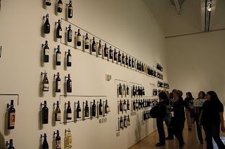
Further into the exhibition,visitors will encounter a huge wall on wine labels and brand identity, glassware, and artful decanters. A gallery will be devoted to the new, global, wine-related architecture, including wineries by Santiago Calatrava, Zaha Hadid, Steven Holl, Herzog + de Meuron, Renzo Piano, and Alvaro Siza. The exhibit showcases a map of the would pinpointing all the places where the wineries are located, the most significant wine-related buildings, incluiding Herzog & de Meuron’s Dominus Winery, Gehry Partners’s Hotel Marqués de Riscal, and Michael Graves and Edward Schmidt’s Clos Pegase.

Ridel decanter

At the end of the exhibit, you'll encounter the smelling section, a wall with suspended flacons teaching you how to identify and name each smell. White is not the color of the grapes used to make White Zinfandel. Red is. Noble indicates "stature and breed," wrote Michael Broadbent in Wine Tasting, first published in 1968. A decade later, when UC Davis professors Maynard Amerine and Edward Roessler released Wines Their Sensory Evaluation, class-based terms such as "distinguished" and well-bred" were rapidly displaced by more phenomenological seemingly democratic language. Petrol is often attributed to wines made from Riesling grapes. While many connoisseurs prize this smell, the world plainly lacks popular appeal. When the German version of the Aroma Wheel was created in 1997, the German Wine Institute eliminated this word, along with entire category of related chemical terms.


Hamster cages is fighting words. First usde to elaborate a French Syrah's warthy nose, the term provoked outrage among conservative tastemakers, who responded by denouncing the young bucks' linguistic excess. One wine merchant acidly remarked: "If they continue like this, we'll soon have customers requesting wines that smell of a sumo wrestler's thighs."


Suspended flacon on smelling wall.


This pretty much covers the whole exhibit. Too bad they didn't have a Tasting Wall...LOL

Sunday, April 24, 2011

UNDERGROUND MARKET


Last night I attended an event called the Underground Market, at Private Works on the Mission. It was my first time going and had no idea what to expect. We got there an hour early and the line was already starting to get buzzy, we were getting anxious, it was starting to rain and some of the vendors were not ready. After a 45 minute wait that felt more like six hours we were in. The cover charge for entry is only five bucks and you have access to delicious food, music and an evening can't be completed without some alcohol.


It's a two story building with patio area as well. After entering we decided it was best to do a lap before committing to any vendor. But not of course without getting a glass of red with me. Upstairs, there was this food stand of duck confit gnocchi with wild cherry glaze, the line was getting super long so we decided to try it. In my opinion it was really good, but the only thing I could really taste was the tons of butter the chef was adding to his frying pan. OMG! I guess some people really like the greasy stuff.


Here's my very proud friend Beny trying the Gnocchi...


It was starting to get warm, so we decided to head outside and see what the fuzz was about. For starters they wouldn't let us drink outside so we had to finish our drinks inside. At the patio, there were two food stands, Wachi Nango, which is mexican coastal cuisine and Hapa SF, which is organic filipino cuisine. I tried both and I must say that they both were amazingly good, but maybe because I am mexican or who knows, the fish tacos from Wachi Nango were my favorite of all. The salsas are really good, spicy enough.

My friend Andre proud owner and chef of Wachi Nango

...my last taco


By the end, we decided to head inside and listen to some interesting bands play. The last one playing was sort of a folk type of music, it was really fun seeing all the people a little bit buzzed trying to dance this type of music. We had a great time!


Monday, April 18, 2011

WEB PAGE


I am currently working in the layout design of my public domain. It is taking a while to finish, I am designing every icon, background and logo included in this page. I wanted to be as unique as possible and express what my style is all about. Please let me know what you guys think about it.