Saturday, May 28, 2011

TAKEN FOR A FOOL


Just like I read on the book "Why we buy" Men are from Home Depot, Women are from Bloomingdale’s. It is completely true, that is why I felt the need to write about how men shop. They are very important consumers that could easily spend more money than any women if it wasn't a fuzz to find exactly what you need in a department store. There are studies that show that 65% of male shoppers who tried something on bought it, as opposed to 25% of female shoppers.

"Guys are genetically disposed to be hunters, so they walk to the woods and are unsuccessful unless they can kill something reasonably quickly and drag it back home and through the mudroom". - Paco Underhill

A store that I could say that nailed it is UNIQLO in Tokyo, Japan. The designer, Gwenael Nicolas not only created a very inviting space, but he redefined the code of retail.


The windowless facade creates more fluidity between the public and retail space.


The lighting creates the feeling of being outside in the middle of the afternoon.

Everything is very easy to find, divided by colors and perfectly sized.


Men don't like asking for directions, they definitely shop the way they drive. They get the information from reading. That is why it is really important to have dressing rooms and registers perfectly located at a customer's reach or with great signage to show them the way.


Men don't really look at tags if they like something and they actually need they are going to buy it either way. 86% of women look at the price tag and 72% of men do. This is why I think it is necessary to also think like a men when designing retail stores for them. Especially nowadays where no one gets married at a young age, men have to learn to buy on their own. We shouldn't take them for fools.


Tuesday, May 24, 2011

The Shins

Caring is creepy


We all now how customer service is the number one priority in successful businesses, caring is crucial. I’ve had retail experience in the past, and my managers have always been very concern about it. However, one thing I noticed at the last place I worked was that they didn’t have any resting areas, during busy days we would even have people sitting on the floor, for me this was unacceptable. How can you have your customers sitting on the floor? Then I asked one of the managers, and the thing was that they didn’t wanted customers sitting, they wanted them shopping. Having a chair or any other kind of sitting area for customers says we care for them.


Another thing I’ve noticed is how couples love to go shopping together, but most of the time store have a no boys in the fitting rooms policy. Therefore, I would have tons of boyfriends standing outside of the fitting rooms, desperate to have their girlfriends come out. So it really got me thinking, why not have a special lounge designed for them, everyone would be much comfortable and hence, would shop more.


Just like REED SPACE, designed by upsetters architects who took the meaning of seating areas to a whole different level.


The client's concept was a "cultural community center" and the main concern was how to integrate the commercial space with the public space.


A space more open to those not familiar with the design, art, or even the shop itself.


The small wooden chair, a symbol of the community center, is attached to the wall serving as shelving too.


The jungle gym a symbol of the park, is echoed in the creation of shelves and stairs.


It is all about delivering a playful message.


Every detail contributes to the simplicity of the space.


The division of the space is created by difference in floor heights.


The chairs can be taken off the wall, which makes the space more flexible.

Monday, April 25, 2011

HOW WINE BECAME MODERN


A couple of weeks ago I attended the SF MOMA for an exhibit called How Wine Became Modern. All my family, including my younger siblings are really into wine, so I was pretty excited to see it. The exhibition was designed by the well known architecture firm Diller Scofidio + Renfro and it was organized as a suite of gallerias. Upon entry, the visitor was greeted by the sound of clinking wine glasses, a peculiar doorbell timed to ring every 3 minutes.


Further into the exhibition,visitors will encounter a huge wall on wine labels and brand identity, glassware, and artful decanters. A gallery will be devoted to the new, global, wine-related architecture, including wineries by Santiago Calatrava, Zaha Hadid, Steven Holl, Herzog + de Meuron, Renzo Piano, and Alvaro Siza. The exhibit showcases a map of the would pinpointing all the places where the wineries are located, the most significant wine-related buildings, incluiding Herzog & de Meuron’s Dominus Winery, Gehry Partners’s Hotel Marqués de Riscal, and Michael Graves and Edward Schmidt’s Clos Pegase.

Ridel decanter

At the end of the exhibit, you'll encounter the smelling section, a wall with suspended flacons teaching you how to identify and name each smell. White is not the color of the grapes used to make White Zinfandel. Red is. Noble indicates "stature and breed," wrote Michael Broadbent in Wine Tasting, first published in 1968. A decade later, when UC Davis professors Maynard Amerine and Edward Roessler released Wines Their Sensory Evaluation, class-based terms such as "distinguished" and well-bred" were rapidly displaced by more phenomenological seemingly democratic language. Petrol is often attributed to wines made from Riesling grapes. While many connoisseurs prize this smell, the world plainly lacks popular appeal. When the German version of the Aroma Wheel was created in 1997, the German Wine Institute eliminated this word, along with entire category of related chemical terms.


Hamster cages is fighting words. First usde to elaborate a French Syrah's warthy nose, the term provoked outrage among conservative tastemakers, who responded by denouncing the young bucks' linguistic excess. One wine merchant acidly remarked: "If they continue like this, we'll soon have customers requesting wines that smell of a sumo wrestler's thighs."


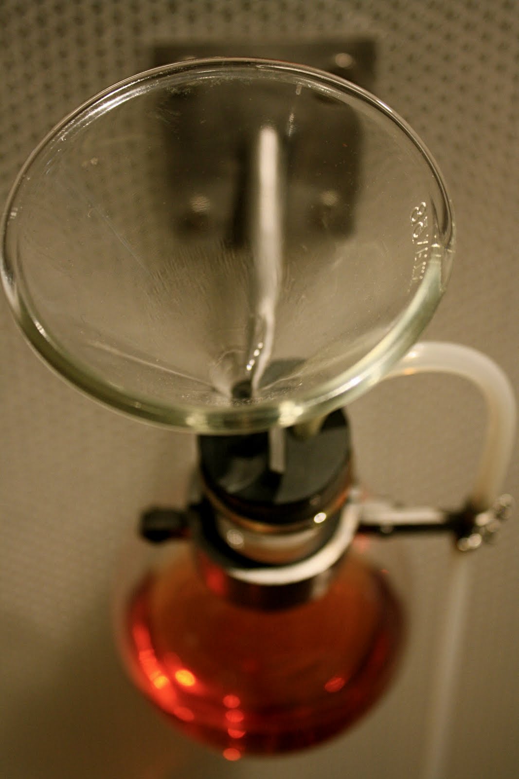
Suspended flacon on smelling wall.


This pretty much covers the whole exhibit. Too bad they didn't have a Tasting Wall...LOL